Full-Service Shopping App: Basket


Crafting an Instacart Competitor From Scratch
Role
Timeline
3 Months
Services
Research, Information Architecture, Prototyping, Visual Design, Design Systems
Challenge
In a Methods of Human-Computer Interaction class at Rice University, my partner and I were tasked with designing the shopper-end of a full-service shopping app from scratch. This required grounding our designs in data-driven insights and emphasizing user-centric solutions throughout.
Case Study depicting thorough implementation of research and design methodology.
5
research methods employed.
Design System
communicating knowledge of color theory, typography, and visual hierarchy.
CONTEXT
Challenge: Create an experience for full-service shoppers that simplifies their workflows and addresses their pain points.
My project partner and I were tasked with designing the shopper-side of a full-service grocery shopping app. Our challenge was to design the shopper-side of a full-service grocery app using UX methodologies and principles across research, design, and testing phases.
RESEARCH METHODOLOGIES
A Holistic Approach
We conducted comprehensive research to understand:
User needs and limitations
Key product flows
Market opportunities
Research Methods & Insights
01
Identifying the User
Why?
To identify: The User, User Abilities, User Limitations
➡️
The average user can shop for more than one client at a time; the user needs help in tracking all of the items and the substitutions.
02
Task Analysis
Why?
To identify: High-Level Functions, High-Level Flows, Information Architecture
➡️
In the average flow, the app must perform all tracking, substitution, and verification tasks. The user simply finds the item and scans it.
03
Function Allocation
Why?
To identify: All Tasks, Human Tasks, Product Tasks
➡️
The user simply finds items and communicates with the client. The app must track items, verify items, coordinate error recovery, and organize the items in regards to client.
04
Analysis of Similar Systems
Why?
To identify: Opportunity Gaps, Market Standards, Product Failures
➡️
Basket must provide item customization, chat photo messaging, and client-chosen replacement functionalities.
05
Decision Tree
Why?
To identify: User's Mental Model, Product Functionalities, High-Level Flows
➡️
The user will flow as if they are shopping for themselves, the app must provide all of the necessary information and decision-making.
Research Summary
Users have 2 tasks: find the item and communicate with the client (if necessary).
An effective app must track items, organize tasks, facilitate communication, and manage errors seamlessly.
OPPORTUNITY
Why a Video Call Feature is Crucial for Grocery Delivery
Research into grocery delivery services like Instacart and its competitors reveals a variety of challenges, most notably order inaccuracies, which can lead to customer dissatisfaction, reduced loyalty, and lost revenue for service providers.
The Problem: Inaccurate Orders & Communication Challenges
90% of food delivery customers report issues with their orders (Restaurant Business Online).
20% of consumers have advised friends and family against using a food delivery service after receiving an inaccurate order (Restaurant Dive).
For shoppers, a common pain point is the inability to truly assess the items they are selecting. While texting and sending photos are helpful, they lack the tactile feedback that comes with physically handling groceries. A key aspect of grocery shopping, especially in the context of fresh produce and perishable items, is the ability to feel the firmness, ripeness, and general quality of the product.
Potential Benefits of Video Calling
Order Accuracy
Clients can immediately confirm or reject items based on visual inspection, helping prevent costly mistakes.
Improved Satisfaction
Direct visual communication can build trust and transparency, leading to higher customer satisfaction.
Industry Leadership
While chat and photo sharing are the norm, no industry leader has implemented real-time video communication.
PROBLEM BREAKDOWN
Key Product Features
Based on our research, we defined the following priorities:
STREAMLINE
Automate organization and tracking.
TEACH
Provide a clear onboarding experience.
COMMUNICATE
Enable video-calling functionalities.
MULTITASK
Enable shopping for multiple clients at once.
PROTOTYPING
Exploring Concepts and Ideas via Iterative Prototyping
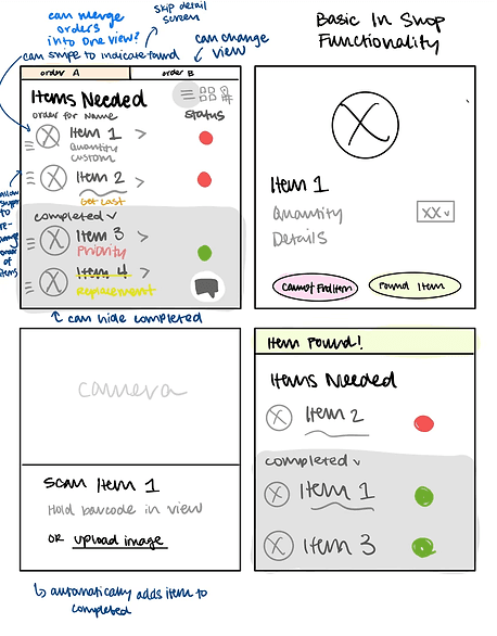
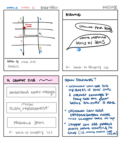
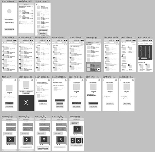
Low-fidelity wireframes helped us conceptualize viable layouts and workflows. Using Figma, we transitioned to mid-fidelity designs, refining structure and visual elements.
Prototyping Round 1: Lo-Fi Wireframes
Prototyping Round 2: Figma Wireframes and First Round of Interface Design
Basket Before My Iteration
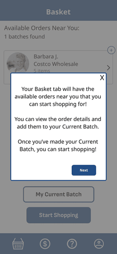
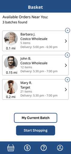
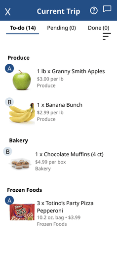
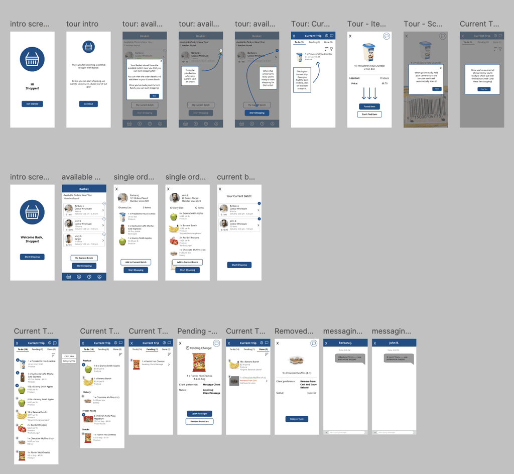
NOTE: The designs submitted for the class met functionality goals but left room for visual improvement. Dissatisfied, I revisited the designs post-project to polish the interface, integrating usability feedback and enhancing typography, color palette, and visual hierarchy.
TESTING
Usability and Heuristic Studies to Outline Further Growth
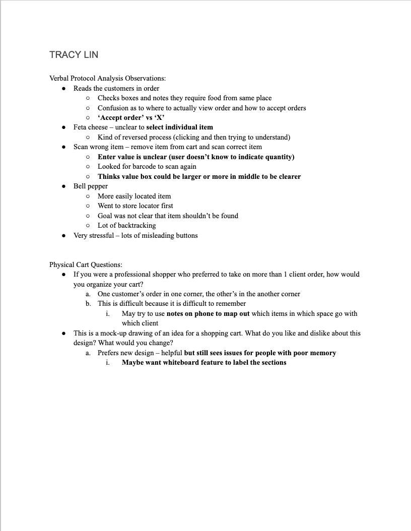
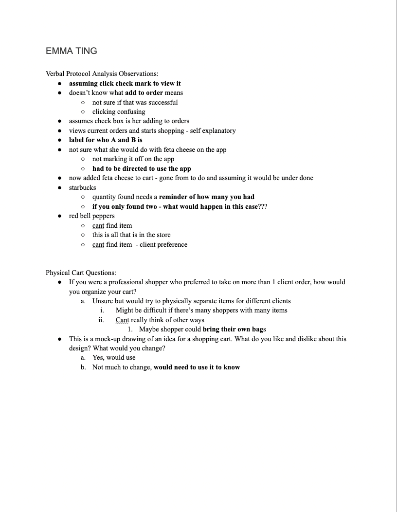
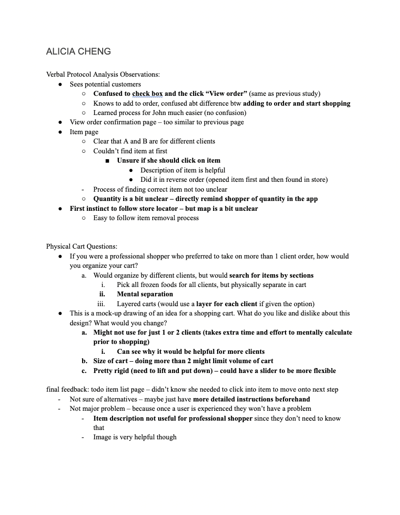
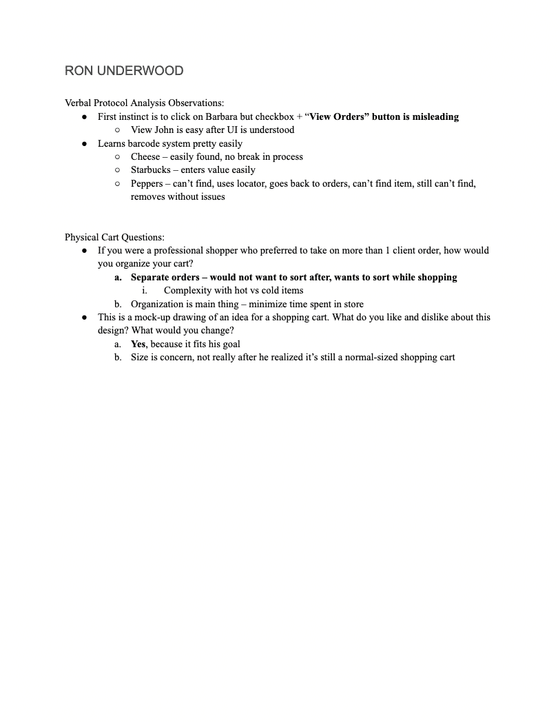
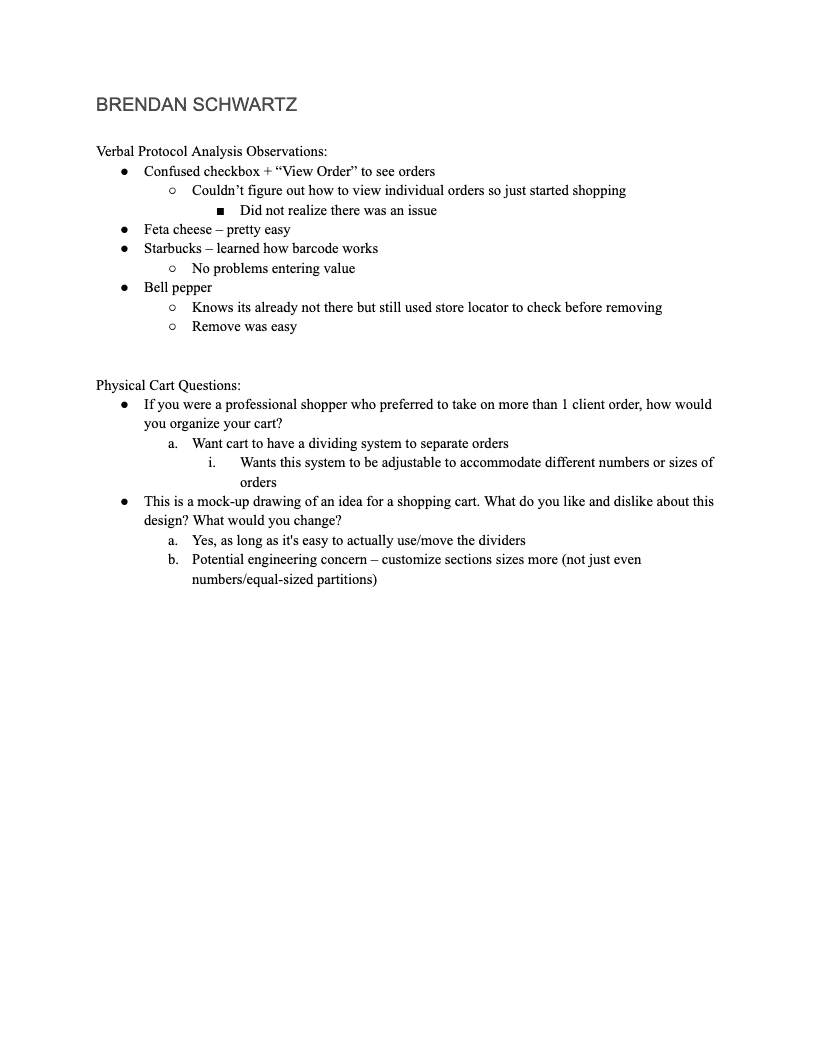
To close off the semester and project, we conducted 6 usability sessions with fellow students to uncover any UX successes and pain points. The study was in the form of a Verbal Protocol Analysis where users vocalized everything they were doing, seeing, and thinking when using our product to complete a task.
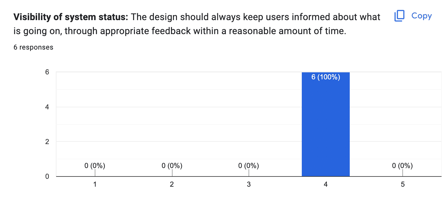
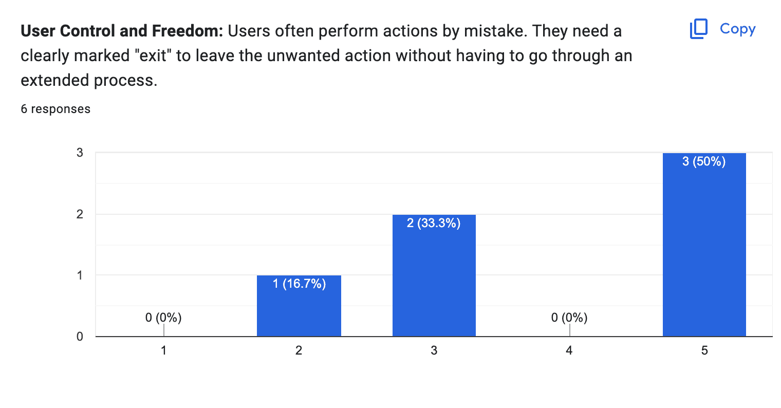
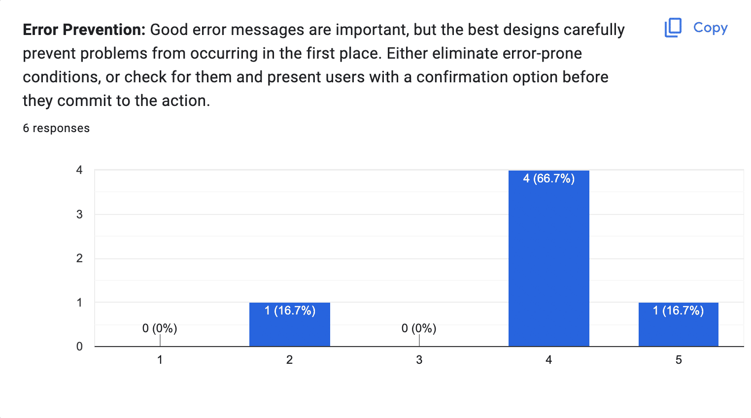
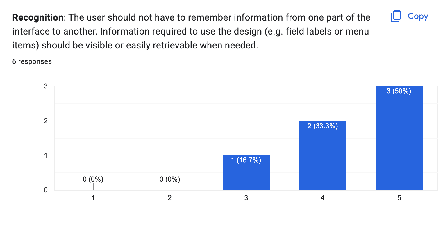
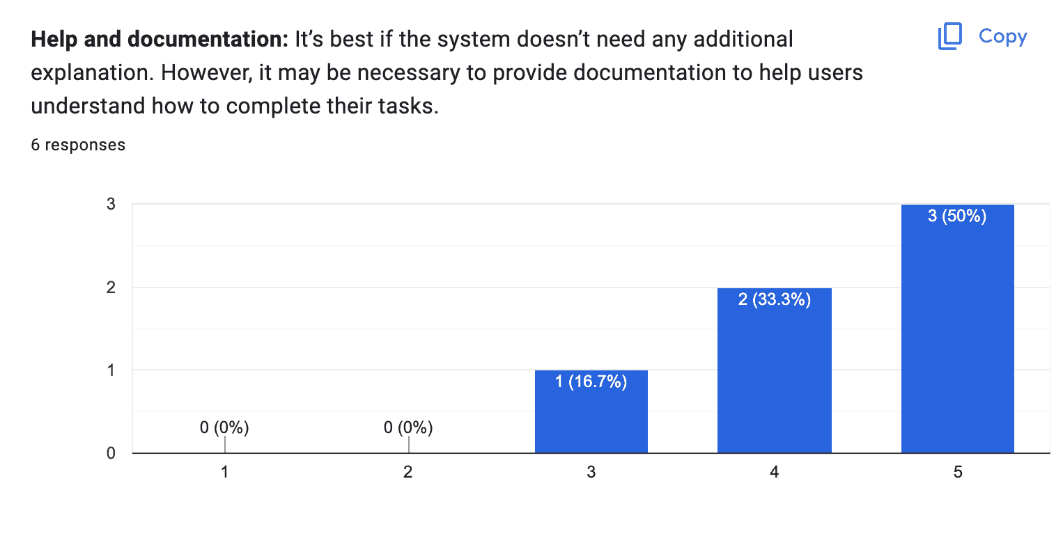
We also had participants fill out a Heuristic survey with 5 heuristics: visibility of system status, user control and freedom, error prevention, recognition, and help and documentation.
UI DESIGN
Visualizing Simplicity
Our professor emphasized the importance of methodology for this project, but I wasn’t fully satisfied with the initial outcome. To ensure the interface aligned with my vision, I refined it to better reflect the core values of convenience, simplicity, and approachability. The updated design incorporates vibrant yet calming colors, playful rounded edges, and thoughtfully placed borders to create a more human and inviting experience. User feedback from testing was also integrated into these final iterations.

Typography
Work Sans (headers) brings a clean and modern aesthetic, while Lato (body) provides excellent readability and a friendly tone. Together, they create a balanced visual hierarchy and a professional yet approachable design.

Color Palette
The color palette reflects Basket’s core values: blue and light blue convey reliability and innovation, greys enhance readability and balance, while black and white provide a clean and modern foundation. Together, they create a professional and user-friendly aesthetic.

SOLUTION
Basket: A Seamless Shopping Experience
Thoughtful Onboarding for Instant Confidence
A key experience in Basket is the initial tutorial. I envisioned this tutorial as an opportunity to guide users through a typical shopping flow while keeping their cognitive load light. To achieve this, I carefully crafted concise UX writing for tooltips, balancing brevity and clarity. By highlighting essential steps and features without overwhelming users, the onboarding experience sets the tone for a confident and seamless workflow.
Designing for Efficiency and Joy
Basket is up to industry standards and provides item customizations from the client. This informs the shoppers of which items to buy and makes their jobs easier and makes the clients happier. I prioritized a simple and consistent interface; the users just want to get their jobs done and my designs help facilitate efficiency.
A System That Does the Heavy Lifting
Basket basically does all the work for the full-service shoppers! Basket organizes all of the items and does so per client, and coordinates all of the communication.
Filling the Gap in the Market
Basket supports video calling between clients and shoppers! This allows for increased order accuracy and customer satisfaction.
OVERVIEW
TLDR: Going beyond the assignment
Overall, this project was a great opportunity to expand my research experience and practice my skills in visual design. I went beyond the assignment and took the time to expand the visual design of the app through a curated design system and visual experience.
Case Study depicting thorough implementation of research and design methodology.
5
research methods employed.
Design System
communicating knowledge of color theory, typography, and visual hierarchy.
REFLECTION
Humble learnings from Basket CEO… Just Kidding!
Methodology Matters: Using HCI methods enhanced my ability to design for functionality and usability.
Teamwork is Growth: I learned to advocate for myself and navigate team dynamics effectively.
Polish Counts: My dedication to UI design reinforced that aesthetics are as critical as functionality.
What I would love to do next:
Continue usability testing with the updated designs.
Gather direct feedback from full-service shoppers.
Expand the app with additional flows and features.


