Revolutionizing how Rice University Owls filter through thousands of resources on the library homepage.
Role
UX Researcher and Designer
Timeline
~9 Months
Services
Research, Prototyping, Visual Design, Product Design, Systems Thinking
Challenge
The Fondren Library website at Rice University was outdated, overcrowded, and failing to meet user needs. My goal was to redesign the landing page to improve usability and accessibility, while balancing user needs with institutional priorities.
Close Stakeholder Collaboration
to help facilitate user needs and institution goals.
70%
anticipated enhancement in the new user experience.
100%
approval from stakeholders after interactive workshop presentation.
20+
user interviews and usability test sessions.
Streamlined Navigation
via data-driven design.
Increased Digital Engagement
via optimized resource accessibility.
CONTEXT
Legacy Website Was Not Reflecting Institutional Rank
Despite Rice University’s prestigious reputation and vast resources, the Fondren Library website did not reflect the institution’s standing. It was cluttered and difficult to navigate, with many users unsure of how to access key resources. Due to time and institutional constraints, a full redesign wasn’t feasible, so my primary focus was improving the landing page to better serve the needs of students, staff, faculty, and the broader community.
RESEARCH METHODOLOGIES
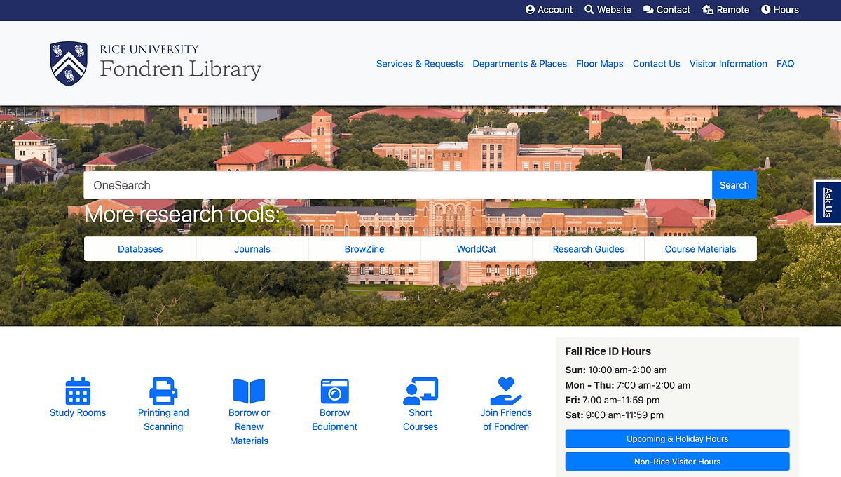
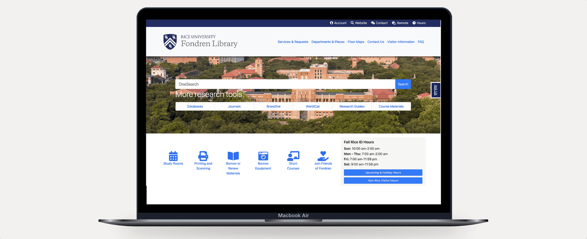
Landing Page Was Overcrowded and Outdated
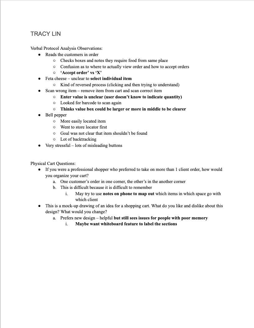
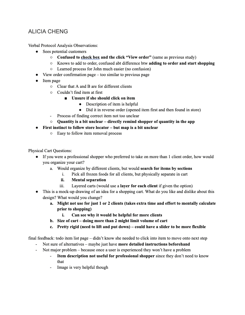
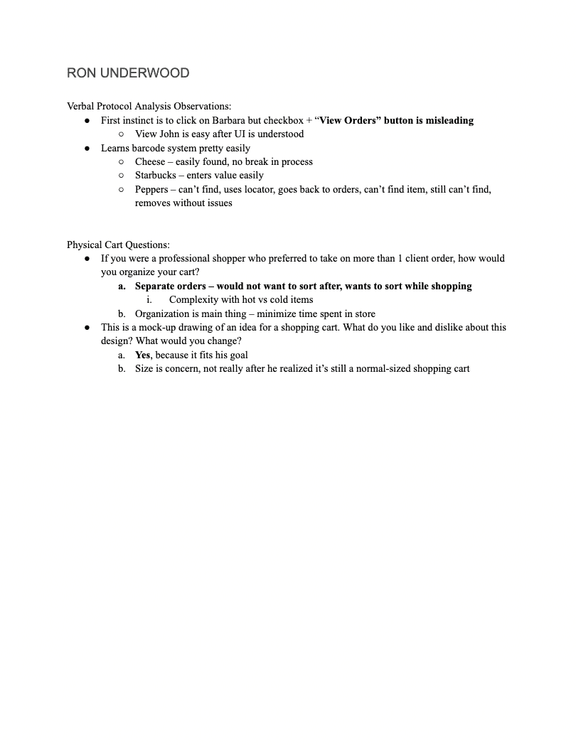
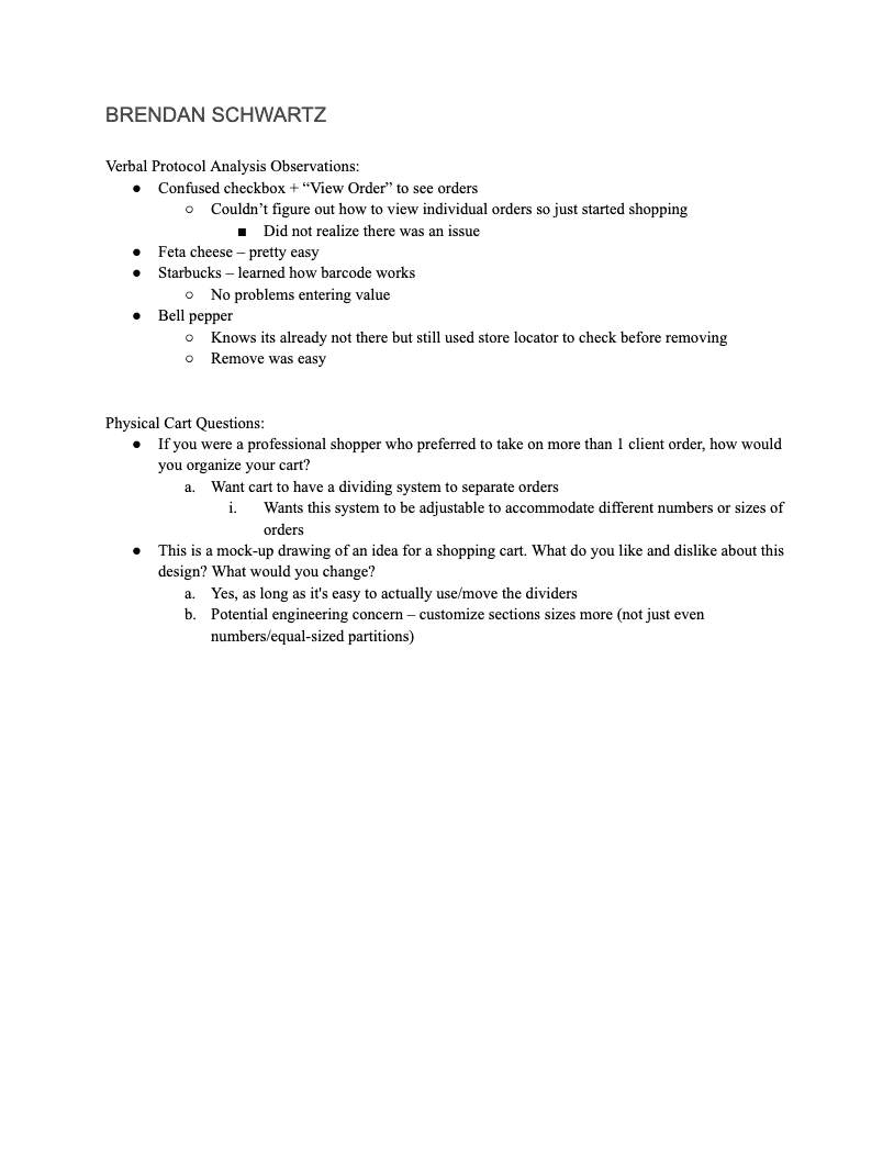
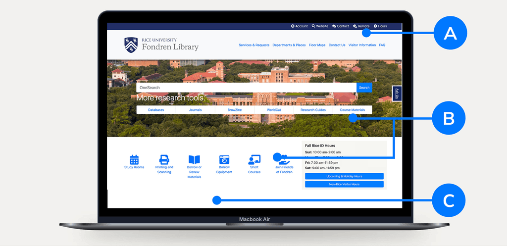
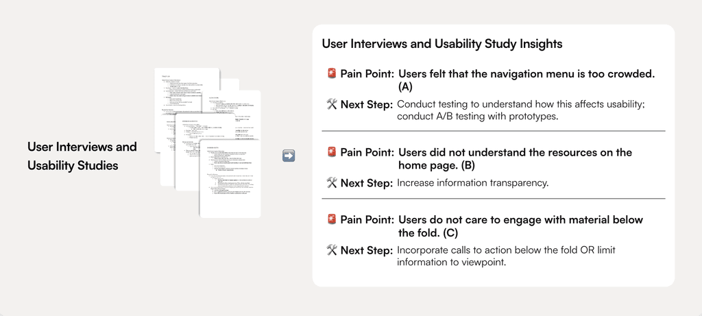
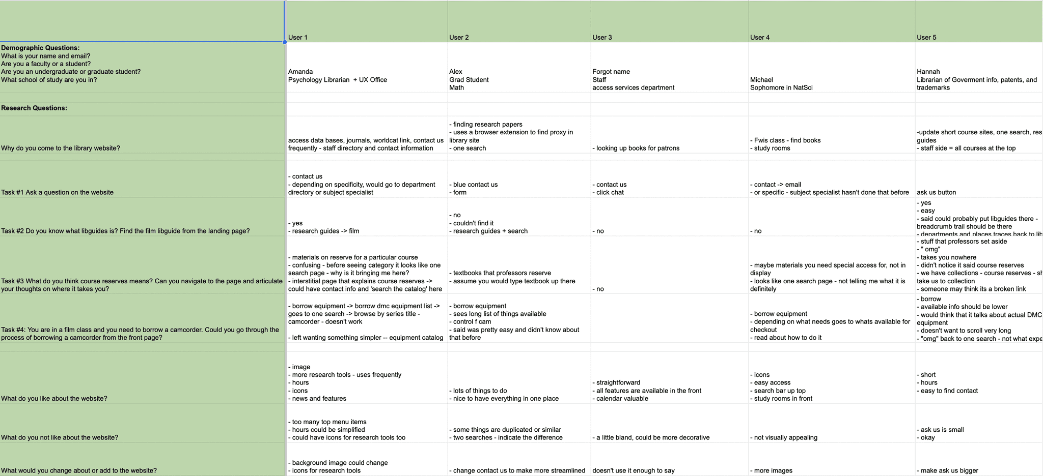
I began by conducting 8 user interviews and 5 usability studies to uncover pain points and identify opportunities for improvement. Key insights included crowded navigation, resource confusion and engagement issues.
MORE RESEARCH & UNDERSTANDING THE PROBLEM
Identifying Priority Issues: Intuitiveness and Navigation
In order to get a better understanding of specific issues and priority failures, I conducted more usability studies and interviews. The Fondren Library Website was not doing a good job of giving users a sense of intuitiveness and navigation.
➡️
Priority Issues
Intuitiveness
Page titles are misleading and frustrate users who navigate to them.
Navigation/Duplication
Users are unsure of which items to choose from in the navigation menu due to duplication.
PROBLEM BREAKDOWN
Reprioritization of Features By Stakeholders
After meeting with some key stakeholders, my scope became even smaller.
Redirect Focus
The navigation menu is locked by admin ➡️ focus on more flexible aspects of landing page.
Collab with Admin
A complete redesign would be less likely to be approved by administration and may overwhelm users.
Create a Product Roadmap
Creating a ghost/demo website can help users get familiar with the design and leave feedback - rather than a full launch.
I answered some problem questions and created statements to clarify my goals and project expectations.
Who is impacted?
Students, staff, anyone who wants to use library resources.
What do we want to achieve?
We want an accessible, intuitive, and organized experience.
What do we already know?
There are issues with organization and information transparency.
Why is it a problem?
Valuable library resources are going unused.
How can it be solved?
We can refine the organization and display of the website information.
I also had some Pre-Design insights I wanted to lay out given my new limits; this helped clarify the project going forward.
Users want a decluttered and organized website.
Users would use more library resources if their functions were more transparent.
Users want a more modern aesthetic.
PROTOTYPING
An Exploratory Practice
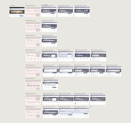
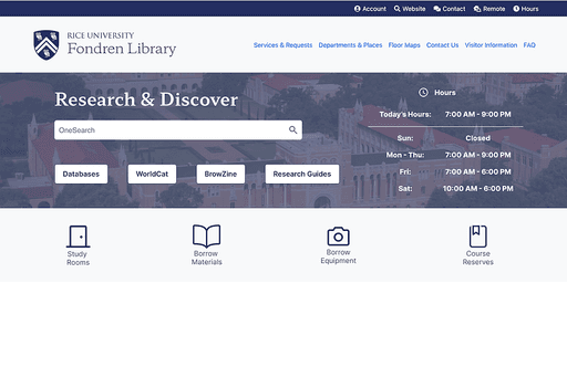
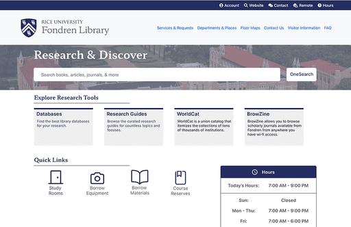
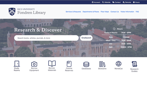
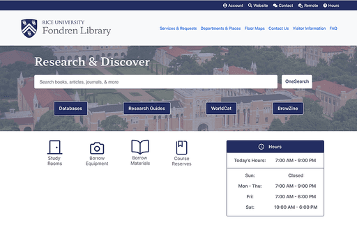
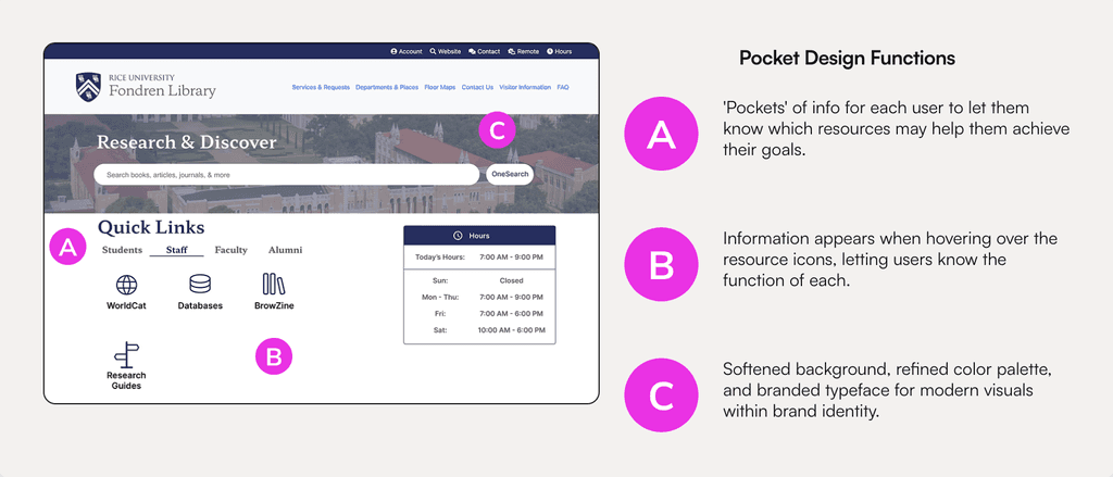
I then went for a maximalist approach to the re-design. I started with 8 different layouts and made different aesthetic variations of each. Each design had the same 3 design priorities that address the user pain points, but I took this as an opportunity to explore different aspects of visual design like layout, rounded versus sharp edges, and white space.
➡️
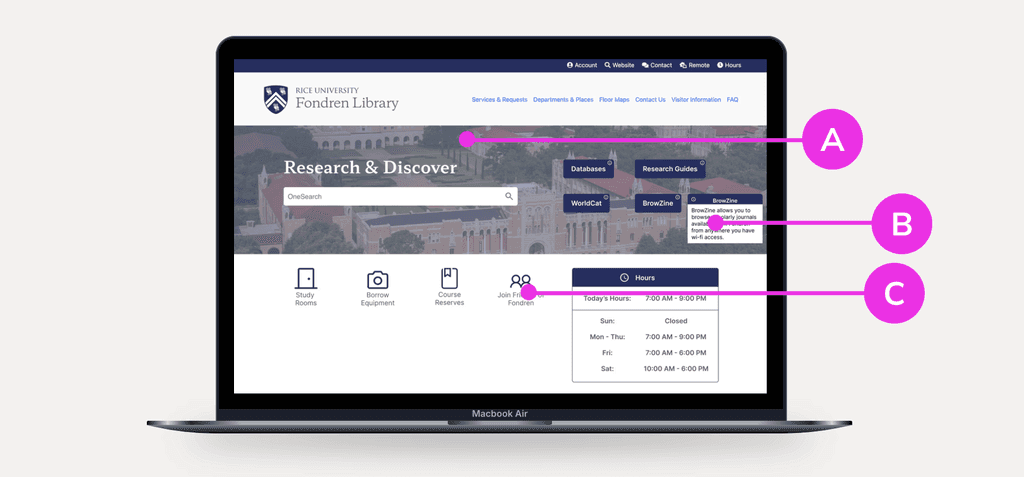
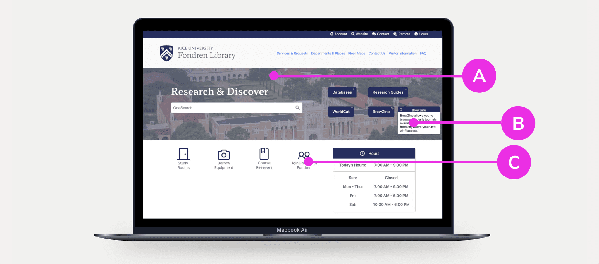
Design Changes for the User
A
B
C
DESIGN CHANGE
Pivoting With Stakeholders: Innovation on the Spot
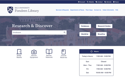
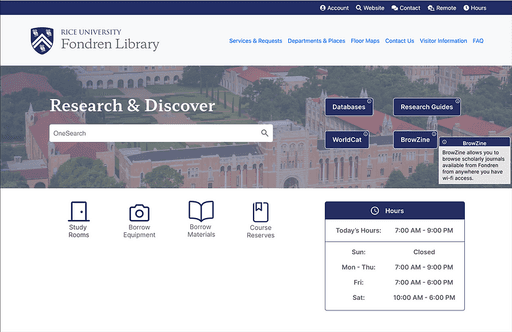
After my exploratory practice, I narrowed down my work to 6 screens that express different visual design practices but still meet the design criteria. I presented these 6 designs to the stakeholders in order for us all to discuss the variations and narrow down popular details. However, the stakeholders and I agreed that the layout could "be more tailored to our wide user base." This led me to the Pocket Design. This idea is designed to address the concerns of all users, help users understand which resources may be for them, and contribute to the modern look.
SOLUTION
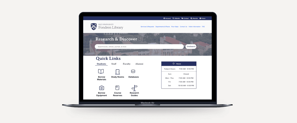
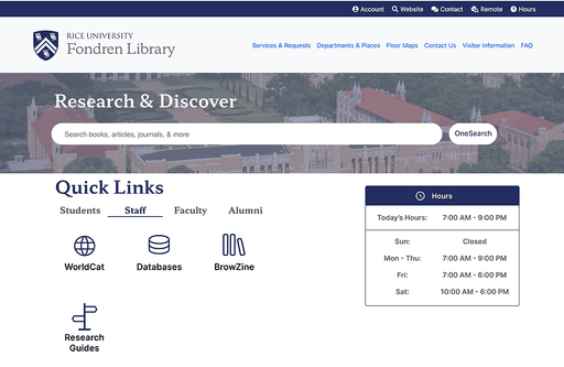
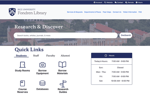
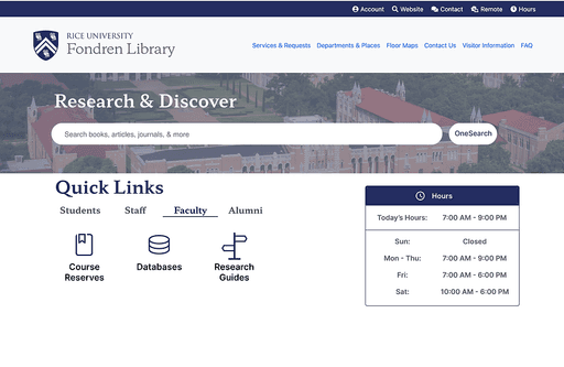
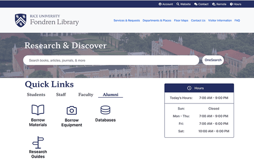
The Pocket Design
The Pocket Design separates information and icons according to user. The pocket aspect of this design supports intuitiveness and navigation of the website. Students (and all users) no longer have to guess where their resources might be because it's right there in front of them!
RESULTS
Stakeholder Presentation Workshop ➡️ 100% approval!
I met with the entire Fondren Library Web Team (6 key stakeholders) to present my project. I utilized The Kano Model, product development framework, to provide a medium of specific feedback tailored to the design. The results were that we would move forward with the Pocket Design for the Fondren Library demo site!
[According to our product roadmap, the Pocket Design will be placed in a "ghost" demo link on the current website. This will help familiarize users with the upcoming design and they can leave feedback for us!]
OVERVIEW
TLDR: Embracing Iteration While Collaborating With Stakeholders
Overall, this project was an amazing experience that challenged my adaptability and reiterated the importance of designer-stakeholder relationships.
Close Stakeholder Collaboration
to help facilitate user needs and institution goals.
70%
anticipated enhancement in the new user experience due to improved functionality and accessibility.
100%
approval from stakeholders after interactive workshop presentation.
20+
user interviews and usability test sessions.
Streamlined Navigation
via data-driven design.
Increased Digital Engagement
via optimized resource accessibility.
REFLECTION
I learned… A WHOLE LOT!
Learning to conduct UX Research has made me a better designer. I am more comfortable with interacting with users, receiving design feedback, and justifying my designs to stakeholders.
Public speaking and presentation skills are key to getting your designs seen and heard. Getting to talk directly with stakeholders ensures that the product is much more well-rounded.
Designing is only half of it. True interest and investment in the project really push my creativity past its limits and remind me why design is my passion.
What I would have loved to do next:
Get my hands on the user feedback for this design.
Conduct usability testing on the design.
Launch something new for my alma mater!


