Mochi


Fostering Connections in Uncertain Times
Role
UX Researcher and Designer
Timeline
5 months
Services
Research, Prototyping, Visual Design, Product Strategy
Challenge
RiceApps, a student-run app-making organization at Rice University, tasked our team with designing an app to help students make meaningful connections during times of uncertainty and isolation. While the pandemic had created a unique challenge for students, my goal was to create a flexible product that could be valuable in various disruptive scenarios, not just a pandemic. I wanted to design an experience that fostered socialization, helping students build connections in a rapidly changing world.
Close PM Collaboration
to facilitate user needs and business goals
100%
user interest rate after testing sessions.
100%
user retention rate after onboarding experience.
CONTEXT
The Pandemic Changed College Social Life
Rice University is renowned for its vibrant social scene, with students randomly placed in one of 11 residential colleges, creating a strong sense of community. However, the pandemic threw this lively atmosphere into disarray. Students stayed confined to their dorms, and the usual social events were canceled, leaving many feeling disconnected and isolated.
RESEARCH METHODOLOGIES
Students Want To Make Friends, But…. It's Complicated
We conducted interviews with 6 undergraduate Rice students to understand how they've made their close friends and their opinions on a socializing app.
Students want to meet more peers across campus.
Social media isn't an ideal platform for students looking to make new friends.
Students enjoy meeting others who are similar to them (interests, humor, etc).
Students prefer group settings to meet new people.
PROBLEM BREAKDOWN
Connecting Students in a Meaningful Way
Based on our research we defined the following key functions:
ONBOARD
Users complete an onboarding experience that feels intentional, personal, and inclusive.
BROWSE
Users can browse through and register for social events.
MATCH
Users are matched with a group using our developers’ algorithm.
REMEMBER
Users can track their upcoming events and keep track of past ones.
Defining the Mochi Experience
PROTOTYPING
Mochi v.1
In the early stages, our project manager (PM) had strong preferences for the visual style and onboarding flow, which led us to jump into design quickly. However, we soon realized the importance of wireframing. We had to iterate rapidly, constantly revisiting our design to improve user flows.
Here's a look at version 1 of Mochi:
Mochi Before My Iteration
UI DESIGN
Mochi: Where Functionality Meets Playfulness
The typography and color palette were thoughtfully selected to balance sophistication with playfulness. Designed for young adults, the app strikes a tone that respects their maturity while fostering a sense of fun. Clever graphics and a rich, vibrant color palette work together to instill confidence and create a cohesive, engaging experience.
After my redesign, my user-testing sessions (n=10) resulted in:
100% user interest rate in Mochi overall.
100% user retention rate after onboarding experience.
90% overall relative efficiency in Mochi capabilities.
90% user satisfaction with UI Design.
Design System

SOLUTION
Mochi: Bringing Socialization Back to Campus
Engaging Onboarding for Seamless Connections
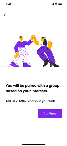
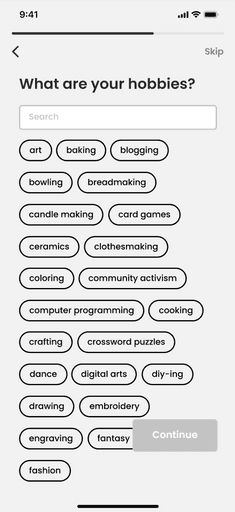
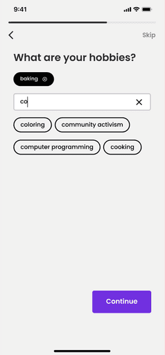
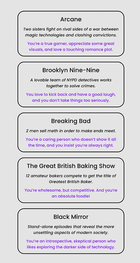
The onboarding experience in Mochi was designed to feel both personal and effortless, immediately establishing a sense of belonging and excitement for users. By focusing on two simple, engaging questions—“Which show best describes you?” and “How comfortable are you in social settings?”—we gathered crucial personality and social comfort data without the complexity of traditional forms. These concise, visually appealing steps ensured users felt confident and ready to jump into the app without feeling overwhelmed. The onboarding process serves as a gateway, setting the stage for meaningful connections with peers who share similar interests and comfort levels.
Browsing and Registering for Events with Ease
Browsing and registering for events in Mochi is meant to feel intuitive and fluid. I designed this flow to allow users to effortlessly browse a variety of social events that align with their personality and interests. With a quick tap, users can register for events that match their preferences, minimizing the friction between discovery and participation. This smooth registration process helps foster excitement and encourages users to actively engage with their campus community.
Creating an Event for Community Engagement
Creating an event in Mochi is designed to empower users to take the lead in building their social experiences. To ensure this feature remains approachable, I focused on simple form fields and interactive elements, avoiding overwhelming users with too many options. By streamlining the process and making it accessible, we encourage students to take initiative and contribute to the vibrant campus community.
OVERVIEW
TLDR: A Collaborative Journey
My time working in this student-ran club taught me so much in little time. I learned the importance of always prioritizing user-centered design, working on cross-functional teams, and justifying my designs to managers.
Close PM Collaboration
to facilitate user needs and business goals
100%
user interest rate after testing sessions.
100%
user retention rate after onboarding experience.
REFLECTION
Key Takeaways
Design for the user. Analyzing research and listening to the user makes us more mindful designers for the next iteration and next project.
Design for developers. Designing at the same table of developers allowed us to design with a clean hand-off in mind. My co-designer and I prioritized keeping a consistent design system with reusable components that the developers can make concrete.
Design together. Working with a co-designer for the first time was immensely helpful. We were able to bounce ideas off of each other and we made sure to be in direct communication with each other as we continued editing and moving forward.
Work with your PM. There was a huge learning curve to this project due to our rocky start. After our quick 360 with the onboarding question, I quickly learned to communicate and compromise with my PM. I made sure to emphasize that we need evidence-based designs to have a viable product.
What I would love to do next:
Conduct market research to understand if this is a real community need.
Flesh out the entire design.
Launch an app with a positive impact!


